Hello there!
Happy November to you. Today I have a quick post about a portrait study that I just finished.
A couple of weeks ago I discovered a wonderful artist on YouTube – Kendyll Hillegas. She’s an illustrator who specializes in food. I checked out her Patreon channel, too, and once I added her to my membership I decided to check out one of her classes on Skillshare. It’s called “Paint With Me: Dramatic Portraits”. Today I’d like to share what I got out of that class.
I’m really glad I took it!
Watercolor painting is my weakest skill. I’ve been trying to improve it, but it’s frustrating to turn out bad painting after bad painting. That’s all you can do, really, when you’re learning a new art medium, is practice, practice, practice. Then take another class and practice some more. So I was ready to try something different, and this class looked like it would be helpful.
The technique Kendyll taught for this lesson was to use watercolor for the initial background layers, then finish the picture with details in colored pencil. It was easier than I thought it would be and I was happily surprised to produce something I liked!
She provides a handful of good photos to choose from for your own study, then goes step by step through the process. It was terribly helpful to be able to ignore the background and focus most of my attention on the portrait. It was also helpful to have very strong contrasting tones in the subject because it made it easier to see how to paint it.
What ended up happening is that every additional watercolor layer became naturally darker, so I didn’t really have to worry about the color I was mixing. Simply applying the additional layer onto the area of shadow was enough to see the difference, and when it dried I could tell whether or not I needed to change the color.
That was the critically important learning skill that I got out of this class. I don’t know how to explain it better. I’m comfortable drawing portraits, but watercolor is a whole different challenge. From a draftsman’s perspective, I see two different techniques to get right in portraiture painting, the first being value (easy enough for a draftsman to achieve using pencil) and the second being chroma (which drafstmen don’t have to deal with because they work in black and white). This study took advantage of my already developed skills with value to help learn how to use chroma.
I could’ve left it after finishing the watercolor portion and still felt like I learned a lot. But at that stage it really looked like a practice piece and I wanted to get it into a more presentable shape. I’m glad I continued, too, because I learned even more!
First, knowing that the painting would eventually be covered with colored pencil relieved a lot of stress about getting the watercolor “just right”. Now I had ‘permission’ to mess it up. Which was going to happen anyway since this was the first time I tried painting a face in watercolor, but now the pressure was off!
Added to that was the knowledge that I wouldn’t need as many layers of colored pencil to get coverage. The watercolor layers would fill in a lot of the white space of the paper that takes hours to fill with colored pencil. So there really was incentive to keep going and finish the study.
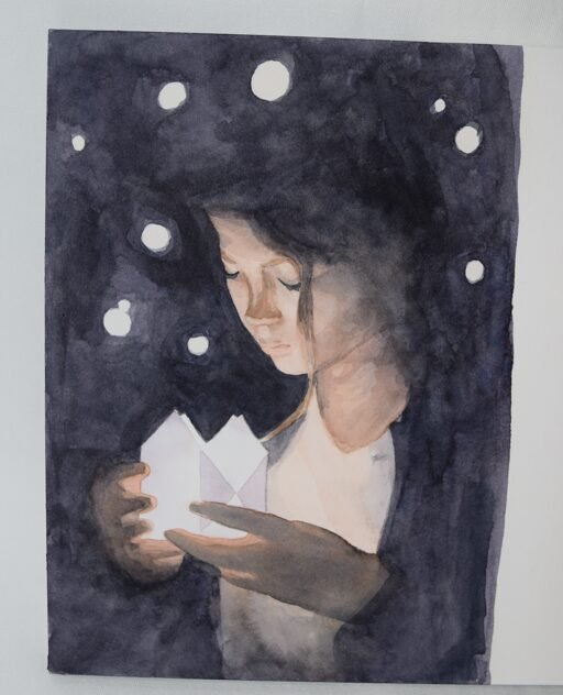
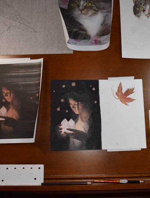
Here are the in-progress photos I took and some notes I made. I highly recommend you take this class if you, too, are hesitant to try portraiture in watercolor but you have a good grasp of basic techniques in creating pictures with tone.
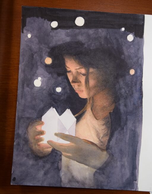
Start with watercolor
his was the result after my watercolor application. I was pretty happy with the initial laydown of color and value. For the background, Kendyll showed how to create black by mixing color, which is usually the best way to paint something that you want to look black, but I found out that I couldn’t mix enough of it on my palette to make it work. So I ended up using a mixture that included neutral tint, and when I ran out I simply dipped back into neutral tint. I think by the time I finished the background I was using all neutral tint! This is about a 5 x 7 inch study, by the way. Small enough to make such a large black background manageable (or so I thought).
The paper is Winsor Newton hotpress watercolor (140 lb) and the paint is from Daniel Smith.
Off the block, onto the drawing board
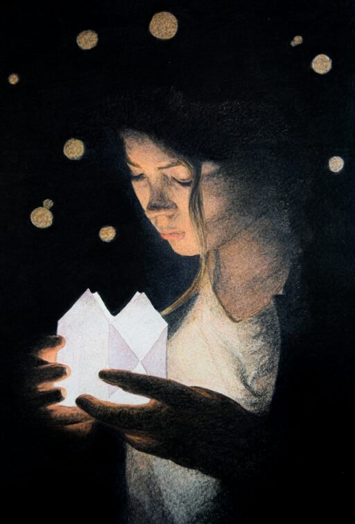
The next step was to apply colored pencil. I started with the face and the lock of hair that runs down her head. As I moved into the surrounding area of background, I noticed that I had to use a LOT of dark gray and black colored pencil to get good coverage. Sadly, I realized that the watercolor background wasn’t dark enough.
It was too late to go back and fix it since there’s no way to cover pencil with watercolor. Instead, I picked up a water-based black marker. You can see here where I began applying it at the top of the page. The dark areas around the face and neck were already created with colored pencil on the watercolor and didn’t have any marker on them.
But marker left it’s mark…
My brilliant idea of using marker did not turn out to be so brilliant after all. I hope that you can see what I mean in this picture. It’s much easier to see from farther away than close up. Here, I’ve used the marker extensively on the ackground area. But can you see the line around the body? This is where the marker stops and the colored encil/watercolor part starts. At this point, I thought that the additional layers of colored pencil would cover that
line. But it didn’t.
The results
This is pretty close to finished. I’ve applied colored pencil onto the entire background. It didn’t adequately cover the line between the marker and pencil area. Maybe it’s not so noticeable in this screen version but it’s definitely noticeable in real life.
So…..there are a couple of additional things I learned, the most important being that, if I use marker again, use it everywhere. It is far more opaque than watercolor, and a few layers of colored pencil can’t make up the difference.
Which leads me to another lesson learnt: this paper is great for watercolor but doesn’t hold many layers of colored pencil. It shouldn’t have been a problem in this study because I shouldn’t have needed many layers of colored pencil….but the marker line added a twist.
Had I stayed with the original watercolor OR completely covered the background with marker I think it would’ve been fine. And any dark areas created with watercolor need to be as close to the finished value as I can get. Otherwise I’ll have to spend more time using colored pencil, which is what I’m trying to minimize in this case.
The study took me about 8 to 10 hours, most of which was spent on the watercolor part because I took it very slow and had to wait for layers to dry. But now that I understand this technique I’m going to continue using it. I love working with colored pencil but hate how long it takes to finish something, especially large pieces. Having the watercolor underpainting is a huge time savings. If I’d tried this using only colored pencil it would’ve taken me weeks – if I’d have finished it! I probably would’ve given up on the black background.
I hope you try it, too. If you do, let me know how you did! I’d like to see what you can do with it!
originally posted at annettezimmerman.com