Today’s experiment came from an idea I saw in one of Ana Calderón’s watercolor books: a De Stijl-inspired limited palette. In her palette, she used water to create tones using only four pure colors. No mixing. Just the colors themselves, diluted for value when needed.
The palette was cobalt blue, black, red, and yellow. The first thing I needed to do was try to recreate the palette. In retrospect, I look at this photo and think “not enough mid tones”. Maybe this is because my brain is seeing the pure value as a mid-tone instead of the darkest saturation of it.
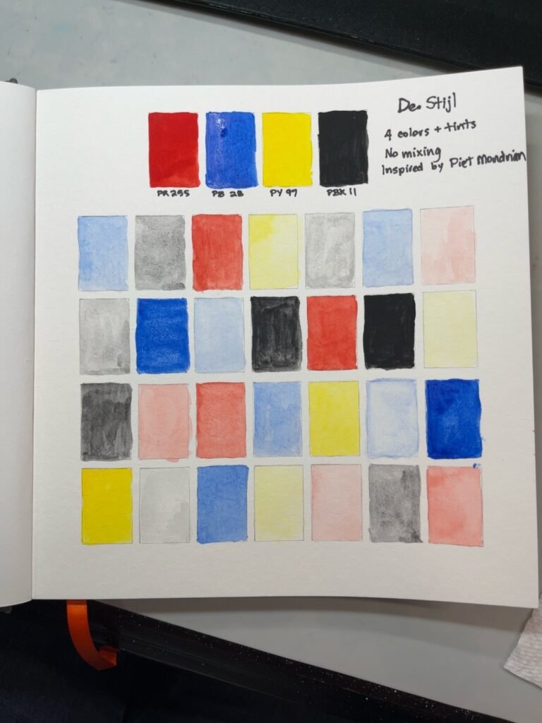
But I think I got 5-6 tones of each hue. So maybe it wasn’t that bad after all.
The subject was the Arc de Triomf in Barcelona, which seemed like a good choice because it has strong architecture, clear shapes, and enough sky, trees, shadows, and figures to make the exercise interesting without turning it into watercolor spaghetti. I took this photo when we were there in 2025:
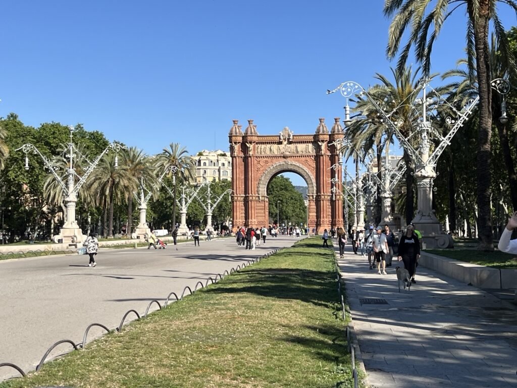
The photo is very busy. I knew I would need to simplify it. The goal wasn’t to capture the scene, it was to see if I could use this kind of limited palette.
At first, my brain tried to use the colors as substitutes for local color. Red could be the arch. Blue could be the sky and trees. Black could be the shadows. Yellow could be highlights. This made sense for about three seconds, which is often how long my best theories survive once actual paint gets involved.
The rule was no mixing. Only values of the original colors were allowed, so I could water down the blue, red, yellow, or black, but I could not make green, orange, purple, brown, or any of the polite little neutrals that usually come wandering in to save the day. I also tried not to let the colors mix on the paper, although there were a few places where the blue touched the yellow and made a tiny accidental greenish mutiny.
This was what it looked like initially:
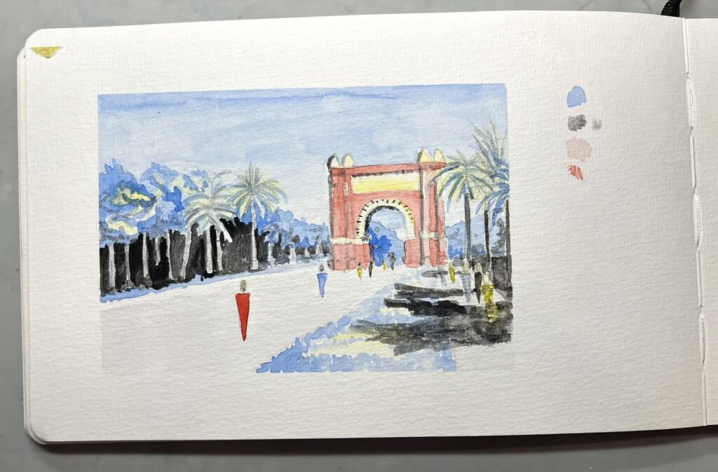
The first discovery was that this kind of palette does not behave like a normal landscape palette. It behaves more like a single-color tonal system with occasional color changes. Or maybe like one main color has to carry the whole painting on its back while the other colors run around ringing bells.
For a landscape or urban sketch, blue felt like the most natural main color. It could handle sky, distance, atmosphere, shadows, water, and even stylized foliage. Red worked better as an accent, especially for the arch and other warm architectural bits. Yellow made sense as a spark of light. Black gave the picture the deep shadows and graphic structure it desperately needed.
But it still wasn’t working for me. So I decided to use my tried and true fix: outline in black pen.
Before adding ink, the painting looked unfinished. It needed bones. The washes were doing something, but they weren’t quite saying it clearly enough. They were mumbling politely into their sleeves.
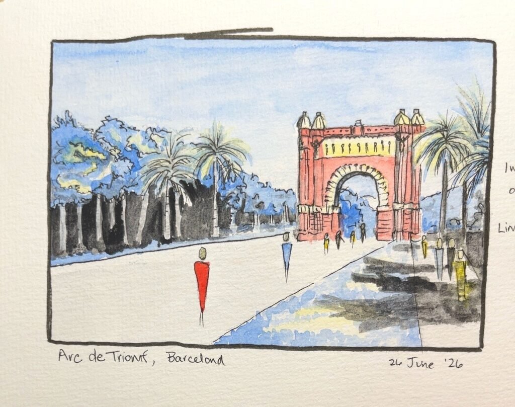
Once I added pen, the whole thing made more sense. The linework clarified the architecture, the figures, the trees, and the perspective. It turned the pale washes into something that felt more intentional, closer to an urban sketch or zine illustration than a traditional watercolor painting. The border helped too (even though the pen slipped). Suddenly it had the feeling of a postcard or a small designed image instead of a watercolor that had wandered off before finishing its sentence.
This was useful, even if the result itself wasn’t especially beautiful.
That feels important to say because not every experiment needs to produce something lovely. Sometimes the result is not the treasure. Sometimes the treasure is the tiny irritated note you write afterward that says, “Well, obviously, the white paper should have been treated as part of the palette.”
Because yes. Of course. Duh. White paper is basically the fifth color in this kind of exercise. With colors this artificial and restricted, white space becomes essential. It gives the image air. It keeps the palette from getting heavy. It makes the weirdness look deliberate instead of accidental. I probably should have left more of it. Or used white gouache as one of my paint colors.
This is one of those lessons I feel like I already knew in another room of my brain. I have used limited color before, especially in my zine illustrations from last year. Those were often single-color or two-color drawings, more like old limited-color illustrations than traditional painting. I knew how to think graphically there. I knew how to let one color dominate and use another as punctuation.
But apparently, when paint enters the room, a trapdoor opens under my common sense.
I don’t know why that happens. If I had done this same exercise in colored pencil or marker, I probably would not have struggled as much. My brain understands those tools as design tools. Paint still makes me think I’m supposed to “paint properly,” whatever that means.
This experiment reminded me that I may need to approach certain watercolor pieces less like “landscapes” and more like illustrations. That might be the more useful path. I’m not sure this exact no-mixing palette is something I would use often for regular landscape painting, but I can see it being useful for Realmscapes-style illustration, zines, and graphic storytelling.
I did think about trying another version. I could trace the original line drawing so the composition stayed the same, then change only the painting choices. That would probably teach me more. But I’m not doing it right now. I have other experiments waiting in the wings, and they’re beginning to rattle their little cups against the bars.
The main lesson is this: a no-mixing limited palette is not really about color harmony. It is about tonal design. Choose one color to hold up the world, use the others as punctuation, and let the white paper breathe.
Which, now that I’ve done the experiment, feels obvious.
Unfortunately, I am one of those people who has to learn by doing. This has gotten me into trouble more than once, but it is also the only way the lesson sticks. I can read the thing. I can understand the thing. I can nod wisely at the thing.
But until I make the thing with my own hands, my brain just files it under “Interesting, Probably Theoretical” and wanders off to look at clouds.