Hello again!
February is here already and the days are flying by faster than I can count. I have a hard time believing January is gone, but then I spent most of it traveling, and that always seems to pass quickly. I managed to get a good bit of writing done while I was gone, but didn’t make any real drawing efforts. And no internet meant no blogging.
Since the return, we’ve been in a state of flux. I’d scheduled our trip so that I’d be back home in time to participate in our local radio show, but ended up missing up due to a series of mishaps that resulted in me being stuck at home without a ride into town. Sigh. At the same time, we had to finish moving everything out of the basement so that the contractors could come in.
Yes, I said contractors.
I won’t bore you with details, but when we bought the house in 2017, the basement was unfinished, merely a big open space with concrete block walls. It took a lot of research to find a contractor we thought we could trust and when we hired them last November we were put on the schedule for work starting in February. At the time it seemed like a very long way off!
But there we were, home and unpacking on Friday, with the contractors due to show up on Monday. We still had to get all the furniture out of the largest room before they arrived. We did it, of course, and now we’re starting Week 4 of the project, but at the moment I’m dislocated, stuck in the living room where I can’t write (there are just too many interruptions) and don’t have room to spread out any art projects.
I can’t wait for the basement to be finished.
Right now all my art supplies are packed into a tiny space behind the sofa. My son moved into the room I was using for my art corner. Once the basement is finished I’ll have this lovely big room to work in, space shared only with my son’s stuff stored in a corner while he’s living with us. It’ll be a huge improvement on the 6 x 5 foot corner of a bedroom I used to have, although I’ll be losing the window. The basement hasn’t any, so I’m making up for it with lots of LED daylights in the ceiling.
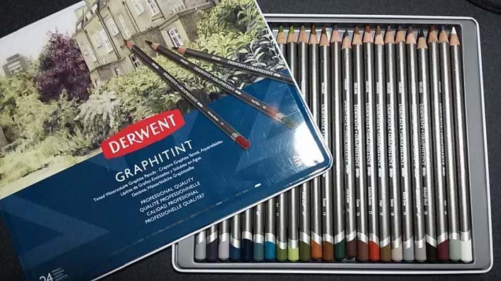
At the moment, though, I’m finding it difficult to get any artistic work done because I have to dig out the supplies and use the dining room table, then put it all away again for meals. So I’m keeping occupied with research and little projects. Like a simple test of the Derwent Graphitint pencils that I’m sharing with you today. Let’s move on, shall we?
How does Derwent Graphitint do when blended without water?
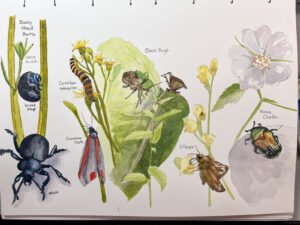
I’ve had high hopes for these pencils ever since I bought them in 2018. At that time, I experimented with a couple of small sketches and posted the results on my old blog, results I’ve included here today. I was (still am) looking for a pencil that would behave like graphite but have a little color. Don’t get me wrong, I love colored pencils, but they don’t behave like graphite. For example, I can’t use a tortillon to blend them like can with graphite. Therefore, I hoped that Graphitint would be a perfect solution.
And they weren’t bad…but they weren’t great either. They’re intended to be used like a watercolor pencil, and are perfectly fine if I activate the color with water. Dry blending didn’t work well for me in 2018.
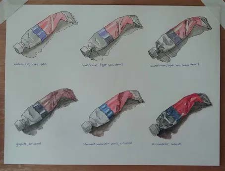
This was a pen and wash study I completed in 2018, but I used the Graphitint pencils for a color wash in the bottom middle picture. To the left of it is watercolor on watersoluble graphite and to the right I used Gamsol solvent on Prismacolor pencil. You can see the color comparison. The water-activated Graphitint really doesn’t show the graphite tones (I used a gray or black color for the shading).
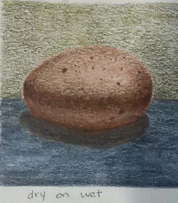
Here you can see another Graphitint attempt, this time on 60 lb drawing paper. I think I activated it with water and then went back and put more pencil on top. It’s a nice effect, but still not quite what I want.
But, I thought recently, maybe it was my choice of paper? My early experiments were on 140 lb cold press and regular drawing paper, not on the Bristol I like to use for smooth graphite pictures. So, since I had the time and needed a small project to work on, I thought I’d try it again.
For this experiment, the subject was a macro-view composition of grapes from a picture I found on Pixabay. Using smooth Bristol, I drew the first version in regular 2B graphite to use later as a comparison. Then I completed the exact same composition with the Meadow and Shadow pencils (and a touch of a couple of browns) of the Graphitint set, using the same size tortillon for blending.
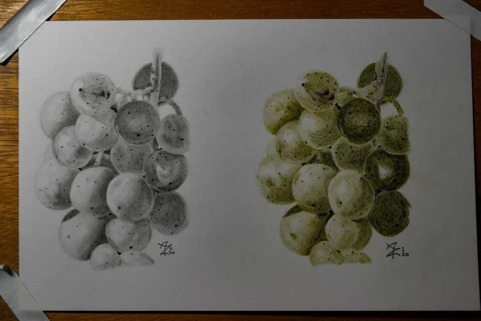
Here you see the 2B graphite on the left and the Graphitint on the right. I found that the Graphitint didn’t want to blend easily. In fact, I think it blended far better on the drawing paper than on Bristol. In that respect, the Graphitint pencils performed like oil-based colored pencils. I had to layer to get the depth and smoothness needed to match the tonal shading of the 2B pencil. Furthermore, I’m not happy with the final look, which ended up more like colored pencil. I wanted my result to look like something similar to a tinted black and white photo, and this had far too much color.
My next step, if I pursue this, will be to create the same drawing in graphite and color over it with watercolor or a light application of colored pencil. Steve Mitchell does some nice work with this, but his results still have a lot of intense color while I’m trying to achieve a very muted look. I think perhaps Lee Hammond has the closest representation to what I’m trying to achieve, if you’re familiar with her work, in which the color enhances the graphite rather than distracts from it. I’ve read somewhere that she fixes the graphite first, then uses Verithin pencil on top. I think that’ll be my next round for this experiment.
But I won’t promise it soon.
That’s because, as I mentioned earlier, I’m doing research into a particular school of art, and I’ve gotten so excited about it that I think I’ll be sharing. I won’t spill the beans here, but I’ll give you a hint that it’s a school from the early 20th century that started with a bang, did some great things, and unfortunately encountered an early demise. It produced influential artists like Paul Klee and Vassily Kandinsky. Even though they focused on abstract design, the principles of this school of thought are applicable to any form. I really want to dive into those principles and see how they can be applied today.
If you know which school I’m talking about (or if you want to find out), check in next time for a short art history discussion. Until then, I wish you a happy week of drawing!
originally posted at annettezimmerman.com