Do you like limited supply challenges? Me too! They help me practice while making me stretch as an artist. This week I’m excited to announce the first of a new series of posts called Art Adventures.
Each week I’ll post a new adventure called a Mission. Each Mission’s goal will be to apply a specified technique in conjunction with a limited supply challenge. We’ll chose inspiration from somewhere across the globe and pick a well-known artist as our guide. Then we’ll “pack” our supplies (which is really fine tuning our limited choices) and start exploring! You’ll even have a unique souvenir at the end of the adventure: your own work of art.
Introduction
Step 1: Materials Selection (#materials)
Step 2: Discovering Inspiration and Choosing a Guide (#guide)
Stop 3: Preparing for the Journey (#prepare)
Step 4: The Sketch (#sketch)
Step 5: The Block In and Major Features (#major)
Step 6: Adding Details (#details)
Step 7: Learning From Your Practice (#learn)
Step 1: Materials Selection
Using my random materials generator, I selected the following materials. I’ve listed alternatives in the table below, but you’re free to use whatever supplies you wish as long as you have no more than 3 colors of your media and 1 line making item. I also suggest using a non-white paper if you have it.
Materials
3 tinted charcoal pencils
3 colored pencils or pastel pencils
Line-making tool
Micron Pigma technical pen
Ink pen
Permanent marker
Paper
Strathmore Toned Tan or Any non-white drawing paper
Step 2: Discovering Inspiration and Choosing a Guide
To find inspiration for today’s artwork, I first turned to my favorite online art history site, The Art Story. Charcoal is a traditional medium that has been used for centuries, so I knew that there was a good chance I’d find something inspirational as far back as during the Renaissance. Chiaroscuro is a technique perfected by the Old Masters that focuses on creating intense areas of contrast in a picture, and would be a good technique to use here. But, after an hour or so, I wasn’t really seeing anything that made me want to pick up the pencil.
As I looked through the pictures, however, I began seeing drawings that the Old Masters did to prepare for their paintings. And some of them were completed in three colors. But The Art Story doesn’t have every artist and every artwork that is known. So I decided to try searching online for Renaissance-era charcoal drawings. That’s when I discovered Frederico Barocci.
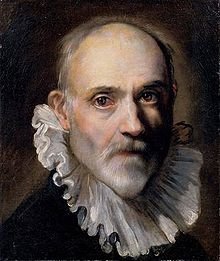
Barocci was an Italian Renaissance painter and printmaker. And he made some beautiful charcoal drawings in preparation for his oils. Rubens was heavily influenced by Barocci, as can be seen. Old Woman and Boy With A Candle is one of my favorites by Rubens, as is his portrait of Isabella Brant.
Isabella’s picture was something that I was interested in drawing. Her eyes, her expression, catch my imagination. What is she smiling about? She seems like someone I would like to meet. I began noticing that these charcoal drawings I’d been looking at were very good for capturing expressions – creating a mood.
Intrigued, I turned to Pinterest and built a board of Barocci pictures that I thought might be good inspiration. The search led me through drawings made during the Baroque period. This was a time during the Renaissance when artists wanted to incorporate real or implied movement into their work. They also attempted to represent infinity, put an emphasis on light and its effects (e.g. chiaroscuro), and focus on theatrical representation of their subjects.
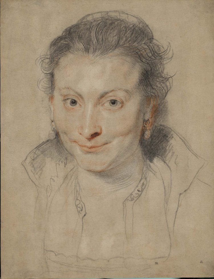
Then the Pinterest search engine showed me the work of Gillian Lee Smith.
Gillian is a contemporary artist from the U.K. who has completed some amazing portraiture. http://www.gillianleesmithartist.com/portfolio/portraiture/
When I saw Megan I knew I’d found something amazing. The eyes of the lady in the picture drew me in immediately. I really liked how the composition melted away from those eyes. They’re dark and mysterious and knowing, and the use of red in an otherwise black and white portrait really adds drama. I wanted to create the same kind of moodiness with my tinted charcoal.
Oh yes, this was perfect!
Now let’s take a good look at Megan, because we want to try to imitate the things that we really like about the picture, but we don’t want to copy it exactly.
First, it’s made with conte and pastel. There’s all this softness around the hair and neck that comes from smudging color. We can do that with our tinted charcoal. There’s linework that creates movement in the hair, and just enough linework around the neck and shoulders so that the head isn’t floating. Then there are those eyes! The eyes are the most detailed part of the drawing. They are centered in the frame. Not only is my attention drawn straight to them for those reasons, but the additional color extending out from the eyes also draws my attention.
What else can we notice? The mouth and chin are unfinished. There is only a faint impression of an ear. The artist used white to highlight the entire upper face area.
These are things we can do with our drawing today.
Step 3. Preparing for the Journey
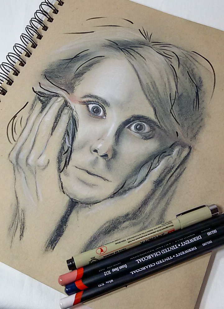
Now that we know what we want to do, our preparation is clear. We need to choose our color palette. And we need to find a subject. I seriously thought about making this into a self portrait, but I really want a subject with good facial expression, something theatrical. I found this on Pixabay https://pixabay.com/photos/woman-surprised-portrait-girl-5892355/
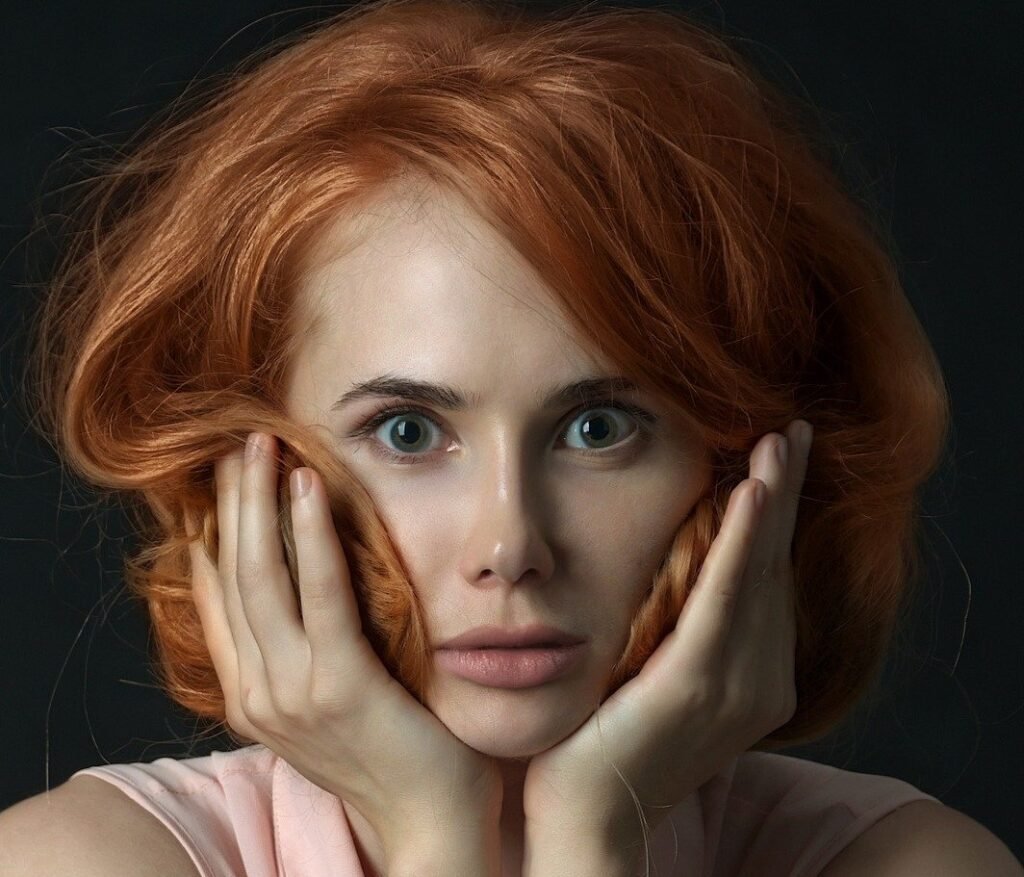
I liked that the picture was a full frontal face portrait. The eyes are prominent, the hair is messy, and there’s good contrast for working in charcoal. She looks enthralled, or maybe a little frightened, or maybe she just heard something shocking. It seemed perfect for our Art Adventure!
Tips for choosing your own subject matter:
A frontal view, full face (human or animal, or consider something fantastical)
Strong contrast (Is there a definite line somewhere on the face that divides the light area from the dark area?)
Eyes that show expression (consider that you don’t have to show much detail, only that you’ll want the eyes to draw attention)
Once you’ve chosen your subject, it will be easier to draw from if you can use a black and white filter on it. Then crop it until the eyes are as close to the center of the page as you can get them, like a bullseye.
To prepare the photo for working, I cropped it so that her eyes were centered in the composition. I liked the idea of adding the hands since they frame her face quite nicely.
It’s time to play with some color!
To begin with, I chose Dark, White #TC21 and Sunset Pink #TC03. I’m using Derwent Tinted Charcoal. I have the 24 set, which I think is the largest set they make and the only set that has Sunset Pink. If you have another brand or don’t have that particular color, you’ll want to choose a color that contrasts with your dark and your white. I tried experimenting with Burnt Earth #TC19 and Burnt Embers #TC06 to replace Dark, but they didn’t seem dark enough. Then I tried replacing Sunset Pink with a couple of other colors, including Burnt Orange #TC02. I think it would make a good substitute for Sunset Pink. Finally, I tried using Ocean Deep #TC12 in lieu of Dark. Bingo!
The final 3 color choices were:
Sunset Pink #TC03
Ocean Deep #TC12
White #TC21
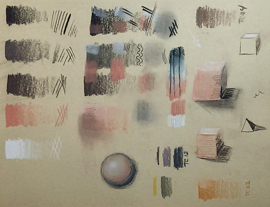
For the Micron pen, I tried a variety of options. I was able to get a well defined line with the charcoal pencil, but I wanted to use the Micron Pigma to create the loose linework that added motion to the hair in our inspiration piece. I finally decided on the brush pen, with the caveat that it didn’t work very well on top of a lot of charcoal. It did, however, show up well under the charcoal.
After exploring a few odd volumetric shapes, I was ready to begin the artwork.
Tips for choosing your own colors:
Since we are limited to 3 colors, and since we are using a colored paper (which will be the fourth color), choose your palette so that you will have a dark dark, a bright white, a mid-tone (in my case, it was the paper), and a contrast color to add ‘pop’
Step 4: The Sketch (#sketch)
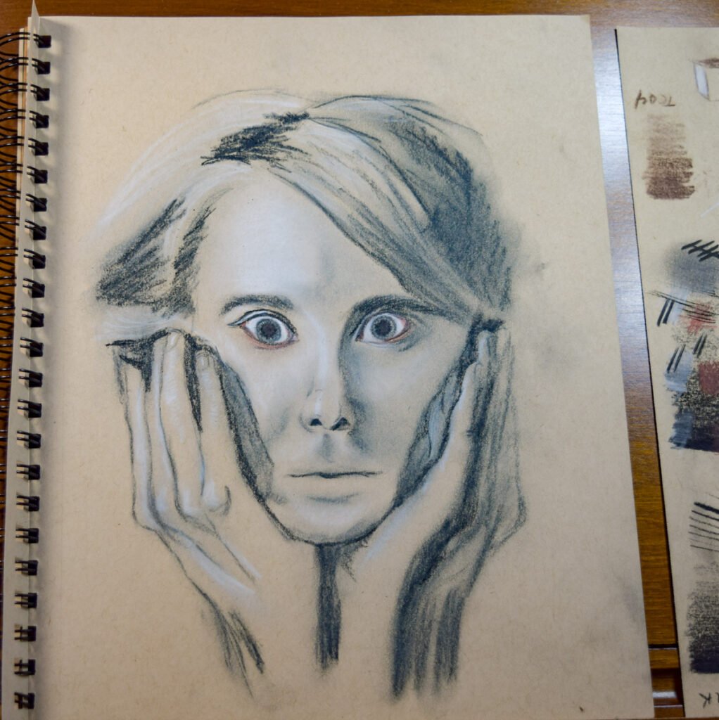
The sketch did not have to be detailed. Remember, our inspiration piece only had details around the eyes. We need to make sure that they’re anchored in the picture, but we don’t have to go crazy with linework.
I used the blue pencil to create the sketch, first marking in the eyes, then the end of the nose, a lip line, brow lines, and general shapes for the hair and hands. I know that there are many people who would not feel comfortable doing this on their own. That’s okay! Get your sketch onto your paper in any way you want. We aren’t trying to learn portrait drawing today, we’re exploring how to use our charcoal pencils.
My first observation was that stray marks made with my tinted charcoal pencil did not come off very easily. Our limited supply challenge didn’t include an eraser, so the only thing I could think of was to rub out the marks, which worked okay on the soft ones but left an ugly mark on her nose! My advice is to use a soft touch while making the sketch, especially in areas where you know you aren’t going to put hard lines later.
Step 5: The Block In and Major Features (#major)
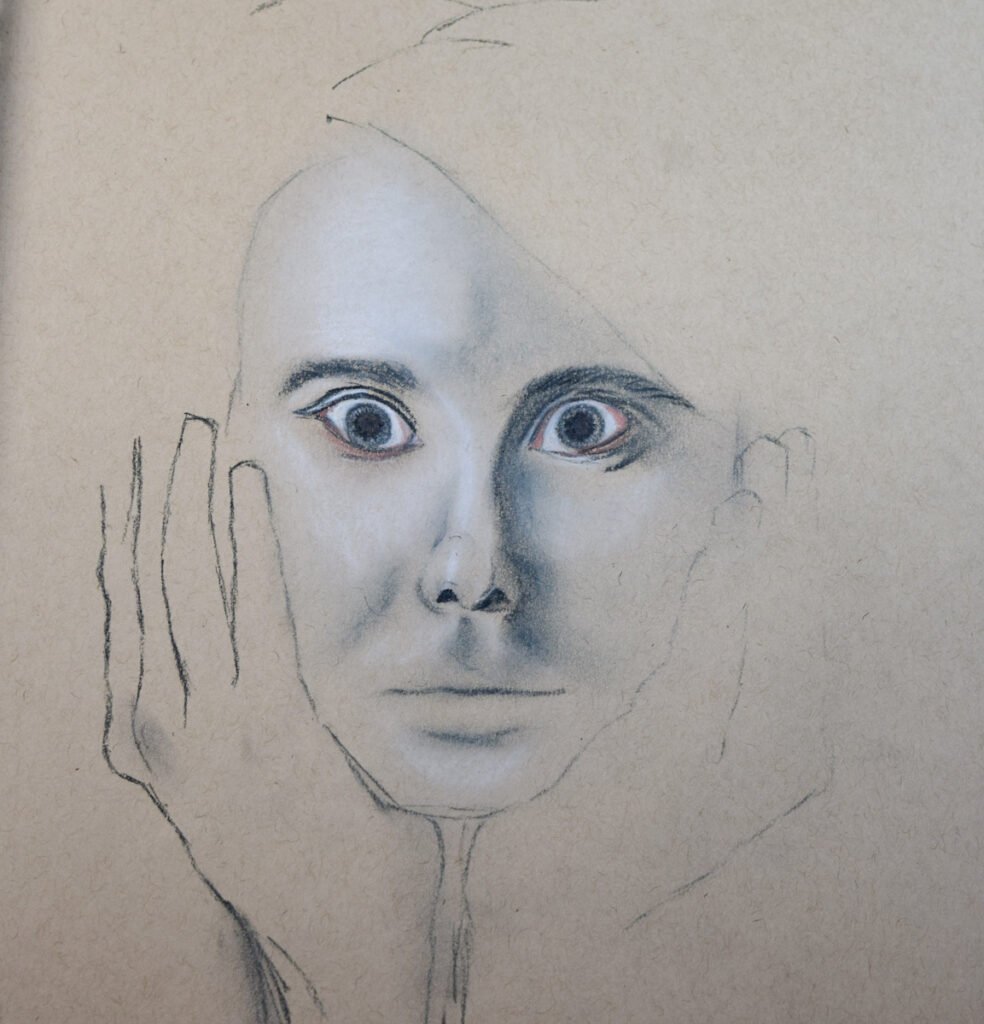
My next step was to start on the eyes. They’d require the most work and if I didn’t get them right I wouldn’t be happy with the overall composition. I used both the pink and blue pencils to get the pupils as dark as I could, then lightly used white and blue for the irises and white for the eyeball.
Next, I placed white in all of the highlighted areas of her face, which is mostly on the right side. I blended this out with a fingertip.
I continued working on her face by adding some pink around the eyes where the skin folded and wrinkled. I used blue to add shadows.
Continuing with blue, I added shadows to the rest of her face.
Finally, I worked on her hair and hands, using the same progression of white and blue.
Tips for blocking in your color:
Start with the eyes, since you’ll be coming back to these to add details as you work through your drawing. Don’t get too detailed at first, though.
Then put down the brightest highlights that you see in your subject image. Smudge in the direction that the light travels; in other words, if your light comes from the right, smudge your highlights starting from right to left.
hen you’ve got a good deal of highlighted area in, change to your darkest dark and put down color where the darkest shadows are. Smudge this from the darkest area into the light in the same manner as you did for the highlights. Leave a definite line right where the edge of the protruding shape pokes into the light, but otherwise try to blend shadows into the lights.
Don’t go for your pop color until you’ve put enough lights and darks down that you’re getting a good feel for where you need it.
Step 6: Adding Details (#details)
It was time to take a step back. I liked how the face was developing. The eyes were even and her nose and mouth were as detailed as I wanted to go. But her eyes needed more work.
I added black lines in the shadow creases, and continued working with white, red and blue to develop the area around the eyes. I increased tone on the brows and added lashes. When I was satisfied with the detail, I added the white highlights in the pupils.
Now it was time for the brush pen.
Was I scared? You bet! So far everything was looking pretty good. Was it going to be ruined with the pen?
I started in the hair, adding a few strokes to indicate the major parts. I soon realized that I’d put in far too many lines. But it was too late. There was no way to fix it.
Except by adding more lines!
I couldn’t stop. And I ended up having to go back to add more blue pencil around the hands to minimize the brush pen a little.
But in the end, it came out okay.
Tips for adding details:
Take your time. Don’t try to add too many, and try to keep them around the eyes. If you find yourself adding details in other areas, smudge them so they aren’t very prominent.
Step 7: Learning From Your Practice (#learn)
Now comes the most important part of this mission. Here’s where we analyze what we did so that we can learn from our practice.
Ask yourself: Did I accomplish what I set out to do? What did I learn?
Before I began, I wanted to make a drawing that showed mood. I wanted the eyes to pop out at me from the middle of the picture, and I wanted the overall feeling to be one of expression, which ended up being ‘shock’. I wanted to accomplish this with tone, but have contributing movement through line.
Did I accomplish this? I think so. What do you think?
What did I learn from this exercise?
First, working with tinted charcoal is quick. This entire practice piece took less than 90 minutes, from start to finish, and I’d go as far to say that most of my time was spent thinking about the drawing.
I noticed that I wanted to spend a lot of effort on details, and at one point I grew frustrated because I couldn’t make the tools do what I wanted them to. If I want to use tinted charcoal in artwork, I will need to remember to keep it loose. It smudged nicely where I wanted it to. It also smudged where I didn’t want it to.
The colors are muted. I could not get a bright blue for the iris no matter how much I mixed it with white. However, the drawing isn’t lacking for want of brighter eyes. In fact, the muted color works far better at conveying the ‘shock’ mood. I’m thinking that tinted charcoal would be great for creating any kind of dark, moody theme.
Finally, brush pen works well with tinted charcoal when used sparingly. I did like how it added movement to her hair. I think next time it would be best to apply the brush pen, step away from the drawing, then come back before adding more. Less is more when combining brush pen and tinted charcoal!
I hope you had fun with this mission and have a souvenir from your own Art Adventure.
Until next time, Happy Exploring!
Note: This post is from an old blog site that no longer exists. It consisted of Art Adventures–practice sessions that helped me develop techniques and skills.