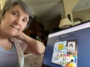
This week’s SketchAwesome program was fun. I didn’t have to learn anything new, and I spent a lot of time working on my self-taught illustration plan, anyway. So I stuck to the program this week and didn’t make any additional sketches.
Sketch 1 - shark
This week’s theme was sea life, and the goal was to complete two sketches in pen and watercolor. Phil Davies’ technique is to use the pen to finish the drawing first, then put the watercolor on top and, if needed, add details with pen at the end. I followed the same direction, but I can get more expressive results if I apply watercolor first and then put in the pen. In retrospect, I wish I would’ve used one method on the first sketch and the other method on the second sketch.
Maybe that was my lesson learnt!
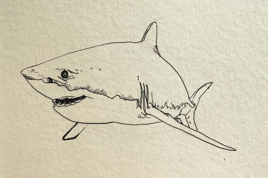
Step 1 was to get the shark outlined. I used a pencil to draw in the shapes and a .03 black technical pen to outline and detail.
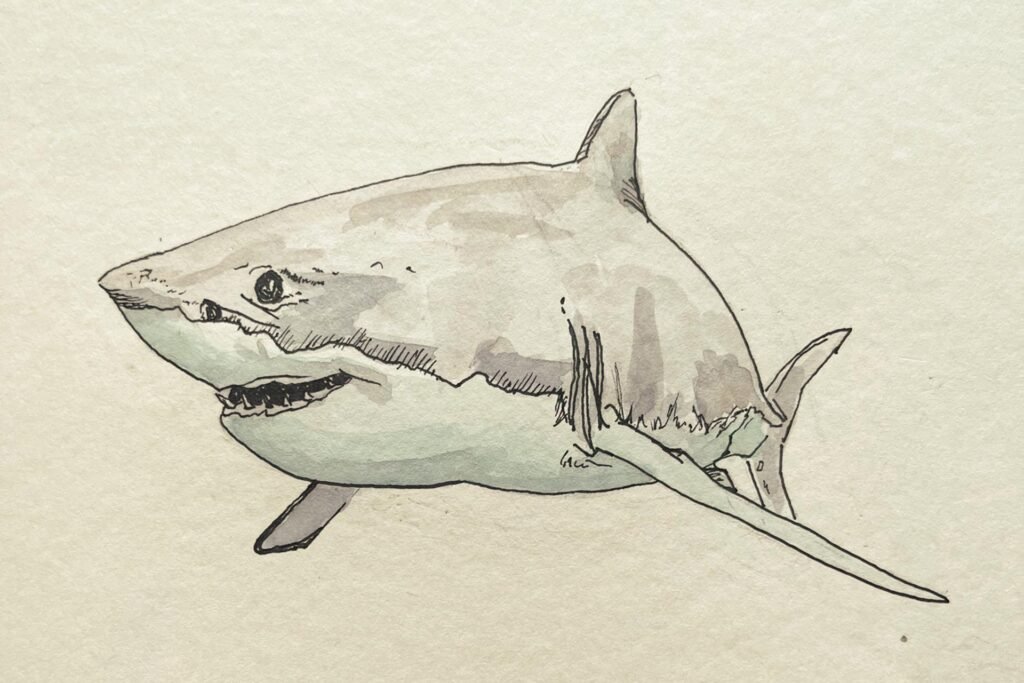
Step 2 was to apply gray and pale blue watercolor washes. For the gray, I mixed alizarin crimson, phthalo blue and azo yellow, then gave it more blue for shadows or more yellow in areas of highlights.
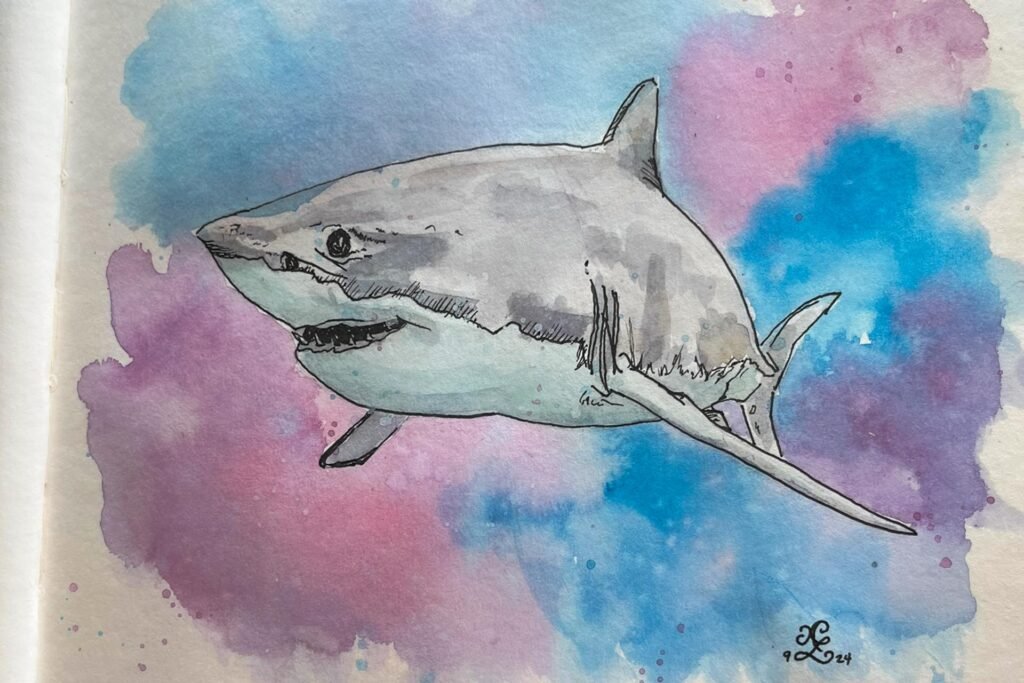
My final step was to put in washes and spatters for the background. Phil likes to go back and put heavy ink outline around his subjects, but I don’t do that. However, this exercise showed me that this paper really isn’t suited for watercolor.
Sketch 2
The second sketch was left up to the individual, and this one wasn’t terribly scary looking. Phil provided a bonus video of a goldfish and I elected to follow along. Originally I thought I’d do the background in ink, but I had neutral tint watercolor in my palette that did the job. My other materials were a .01 black technical pen, a 3H pencil, watercolor supplies, and quin red, cobalt blue, and azo yellow.
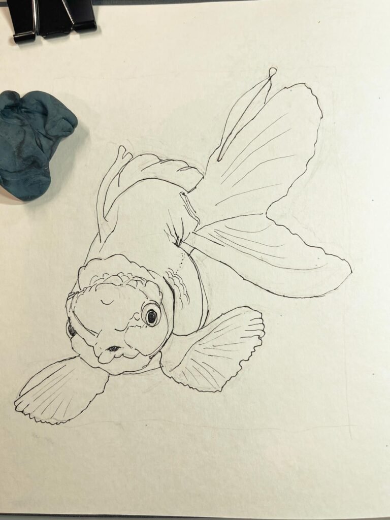
Again, I started with the pencil sketch. The difficulty with this reference photo was the foreshortened perspective. I really had to do a lot of restating before I could ink the line art.
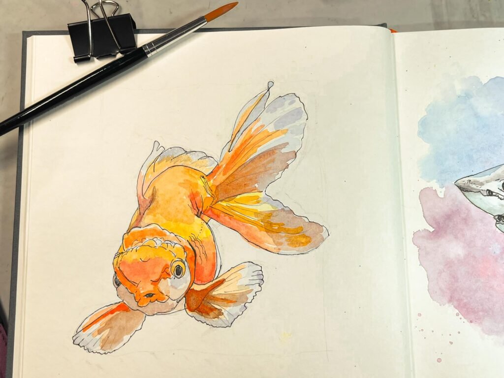
The first layer of color was a yellow wash in the highlighted areas. I painted oranges on top, then the light blue wash on the fin tips. Then I went back and added darker shadows. I also tried applying colored pencil on top. It didn’t seem to make a difference.
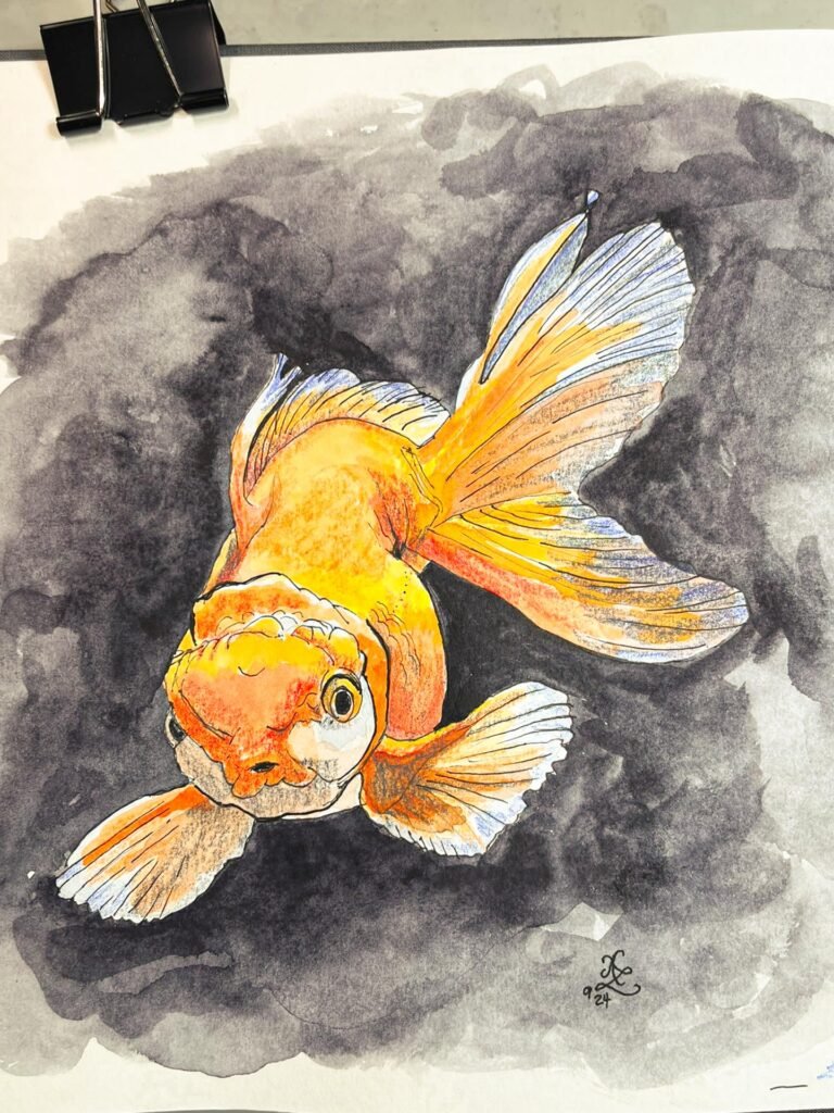
I mixed up a puddle of neutral tint for the background and was careful when going close to the fish. The paper didn’t like how wet my wash was, but it didn’t pill or buckle too much. The final step was to add the lines in the fins.
Thoughts on the process
This week’s sketching was light and fun. One thing I could improve upon is to try and sketch faster. The goal is to make a sketch, not a finished drawing, and I worry too much about getting everything “just so”.
I wish I’d thought of this earlier, but a nice springboard off this could be to use the same subjects, but try drawing them from my imagination at different viewpoints. For example, sketching a side view of the fish and a front view of the shark. Something to think about next time.
Revisit the first week’s program using this link. The SketchAwesome program is at DrawAwesome, Phil’s website. Let me know if you are also doing the sessions, I’d love to see how your sketches turn out!