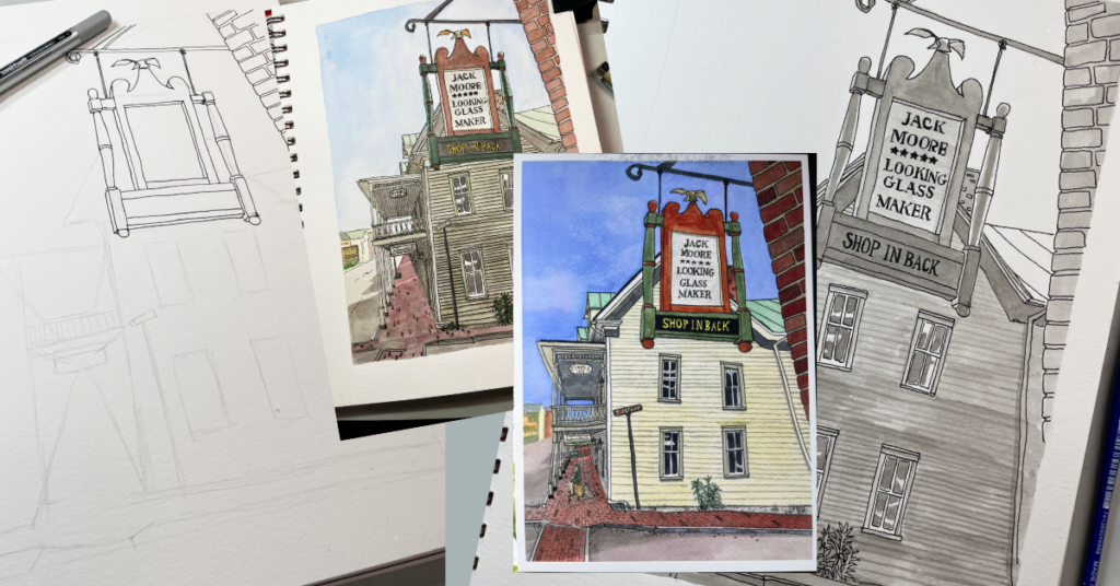
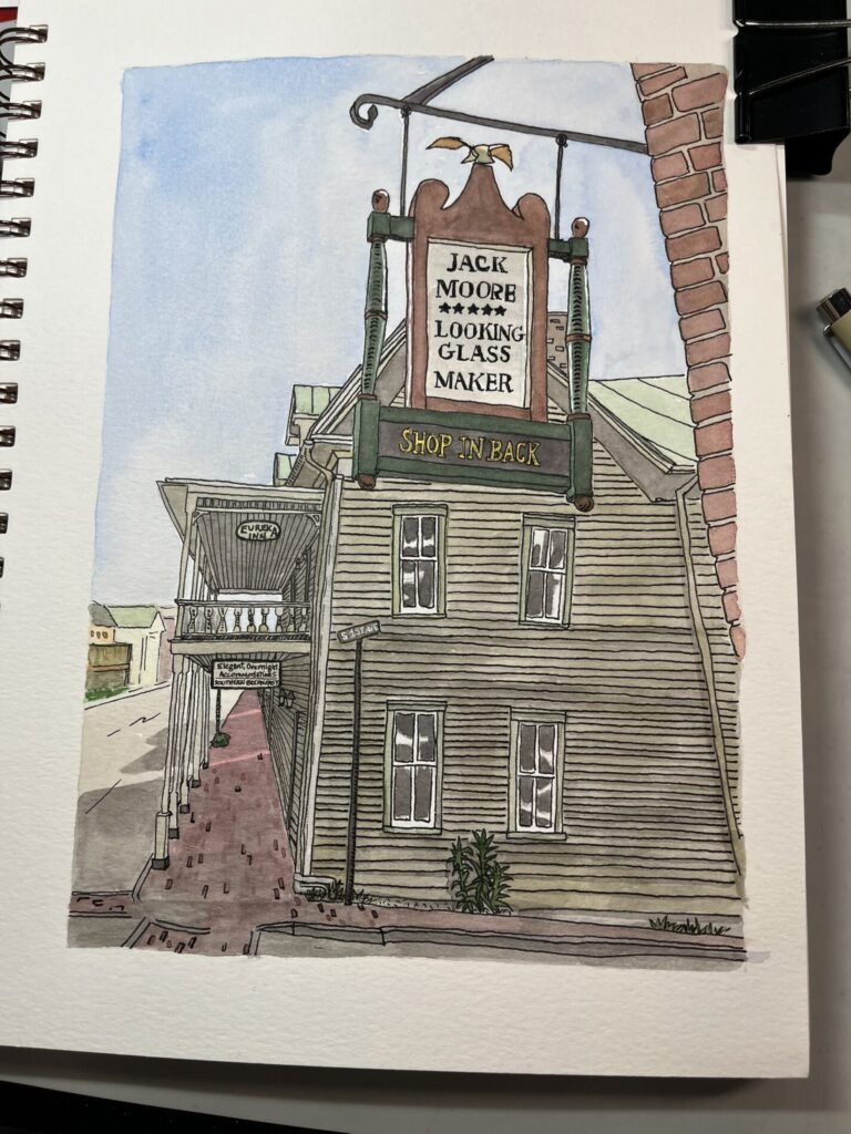
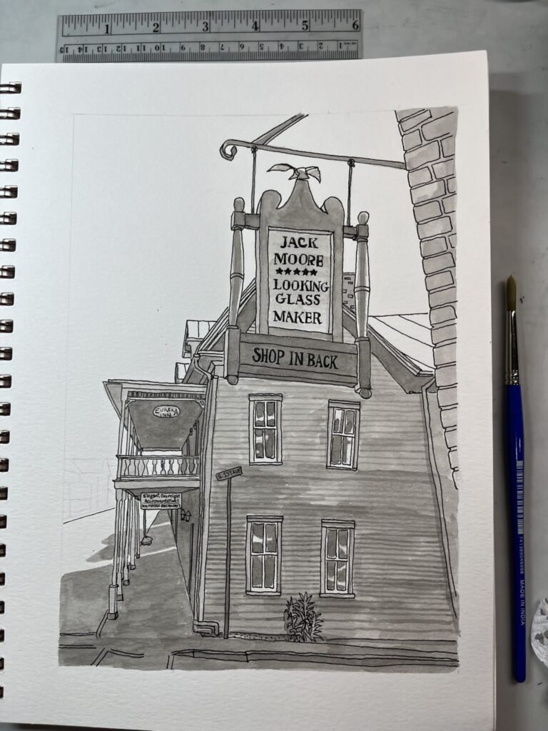
The first version of Jack Moore’s Looking Glass Maker taught me what the piece wanted to become. Unfortunately, it did this by turning into a muddy, faded-looking mess.
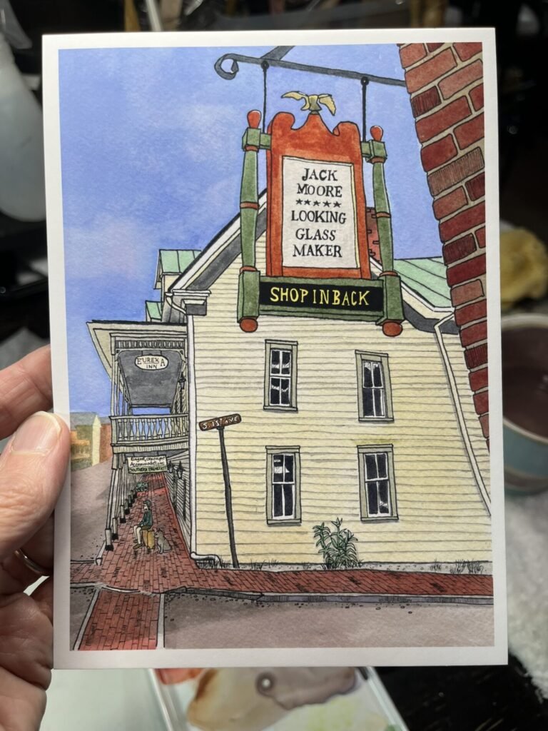
I’d originally photographed the sign during a hot, humid walk through Jonesborough. The words—Jack Moore – Looking Glass Maker – Shop in Back—sounded as though they’d wandered out of Alice in Wonderland. The backlit sign, the gingerbread railing, the brickwork, and the old-fashioned language on the Eureka Inn all suggested a story.
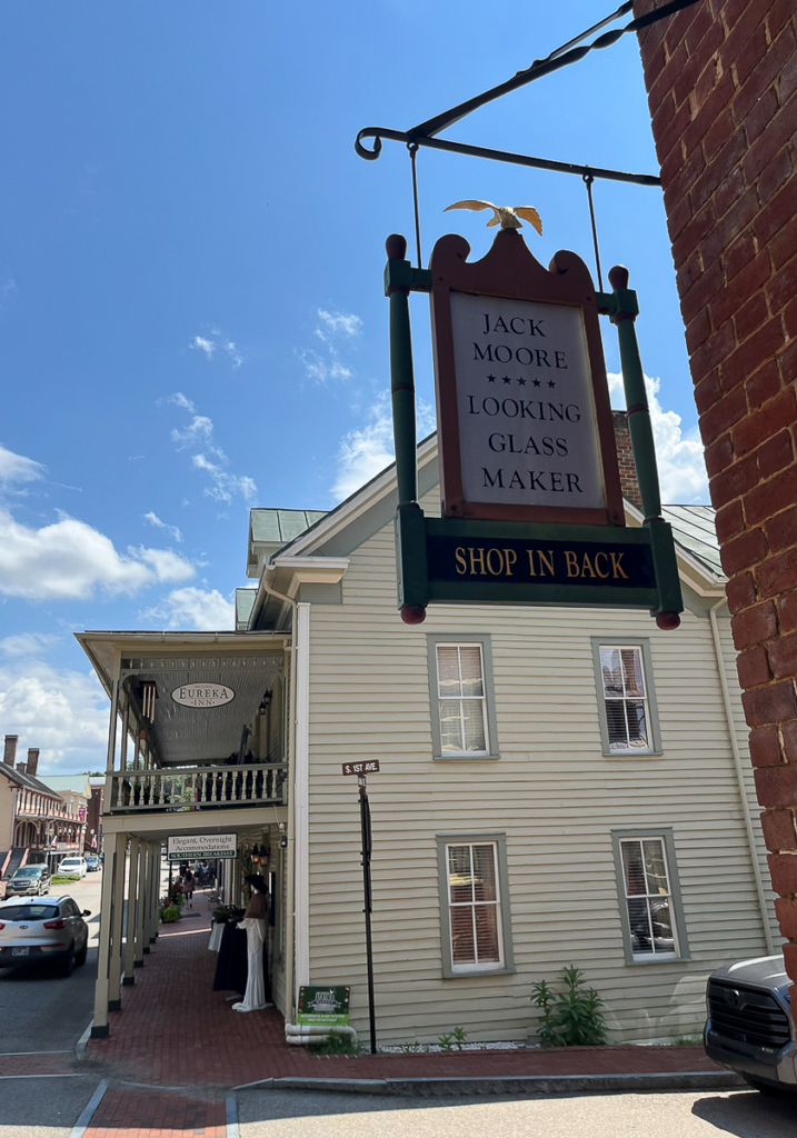
So I removed the cars, chairs, garbage cans, and other modern clutter. I kept the wonky perspective and the strong shadows. I let the windows and rooflines become uneven and slightly strange.
The wonkiness turned out to be exactly right, but the colors weren’t. The dark ink I used in the underpainting made the finished piece too muddy. Instead of saying “storybook town,” it said “faded newspaper clipping discovered in an attic.”
So I made it again. For the second version, I started over on a different kind of paper: Stonehenge watercolor paper. I don’t usually like using Stonehenge for watercolor. It’s soft, it doesn’t tolerate a lot of water, and lifting color from it can damage the surface. But it was the whitest paper I had. And since the first version’s main problem was its murky color, I decided the brighter surface was worth the risk.
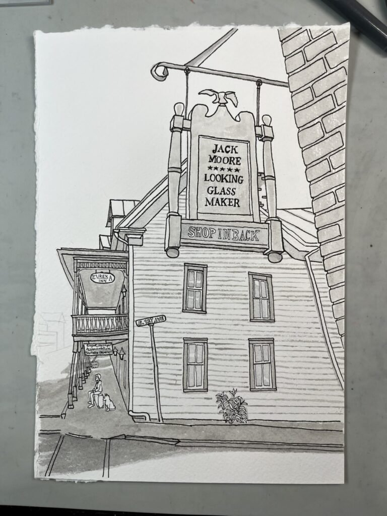
I also changed the composition. I made the sign slightly larger and moved it closer to the middle of the picture. More importantly, I added a boy sitting on a piece of luggage, plus a cat.
Adding people makes almost any scene more interesting. A building can be beautiful or unusual, but a person immediately raises questions. Why is the boy sitting there? What is he waiting for? Why is he with a cat?
The boy is wearing historical clothing, although it isn’t particularly noticeable, which ended up being a good thing. I realized too late that the buildings may look historical, but they all have modern roofs. I hadn’t yet painted the background buildings when I noticed this and was able to make their roofs darker. Since they’re loosely painted and don’t have much detail, the problem is less obvious there.
The Eureka Inn, however, was already wearing its modern green metal roof. It was far too late to do anything about that. So perhaps the boy isn’t dressed in period clothing. Perhaps he’s wearing a costume. Perhaps he’s waiting for a time machine that’s running late. The painting doesn’t have to answer that question.
But I think the biggest improvement came from changing the underpainting. This time, I restricted the ink layer to smaller areas and used a much lighter, 20-percent tone instead of the darker tone I’d used before. That small change made a remarkable difference. The colors stayed brighter, and the painting no longer had the heaviness that bothered me in the first version.
What I kept was the perspective—the part that made me want to paint the scene in the first place. The sign is being viewed from below, while the long, tunnel-like porch of the Eureka Inn leads toward a vanishing point almost directly behind the lower sign. It shouldn’t work as neatly as it does, but the strange geometry gives the whole painting its personality.
I also kept the uneven windows. They aren’t perfectly aligned, and that’s exactly why they’re interesting. The boy and cat are tiny, but they change the entire story. Without them, the painting is just a view of a Jonesborough street. With them, it becomes a moment. Something has happened before this scene, and something may happen afterward. They give the piece a life.
That’s what I wanted it to do. It didn’t need to explain the story. It only needed to leave enough room for someone else to imagine one.
I’m glad I didn’t give up when the first version didn’t turn out. It wasn’t useless. It showed me what needed to change. The first attempt had the right idea, but it needed brighter colors, lighter handling, and a little more life.
I had to listen to it more carefully.
The finished artwork is called Jack Moore’s Looking Glass Maker. I’ve made 5×7 prints on premium matte art paper, priced at $10 each. Several copies are currently available at the Jonesborough Visitor Center.
This piece wanted to be made. I just had to make it twice before I understood what it was trying to say.