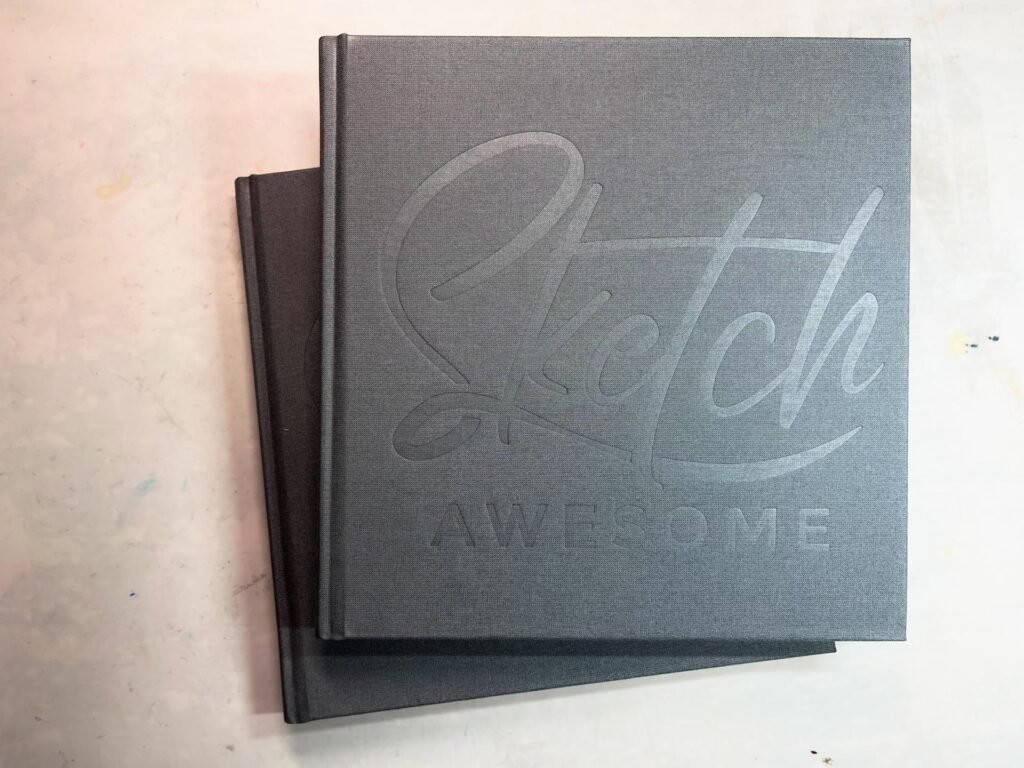
The first week of SketchAwesome is live. The class materials I’ll be using are watersoluble graphite pencils and a limited watercolor palette.
I’m actually excited about this. I’ve played around with the soluble graphite in the past but not enough to actually get comfortable with it. So a week’s worth of sketchbook practice will be very useful.
But first I need to do the sketchalong part.
Materials
The initial instructions were to experiment with the different methods of pencil application. I have two different brands of pencils, and I wanted to see which of them worked better for me. Here’s a list of what I’m using:
- Faber Castell Aquarelle Pencils (HB/2B/4B/6B/8B)
- Derwent Graphitone pencils (2B and 4B grades)
- My SketchAwesome sketchbook
- Watercolors: alizarin crimson, a neutral yellow (it may have been Hansa), and cobalt blue
- paper towels, travel brushes, water and a water container
Part 1: Playing with soluble graphite
The first session focused on experimenting with different ways to use the medium. I tried four different applications: putting it on dry paper and wetting it, wetting the paper before applying the pencil, wetting the pencil tip and applying it to dry paper, and making dry puddles with the pencil to use like a watercolor pan.

After that, I attempted to make gradient swatches, first by taking the brush from the dark end to the light end, then the opposite direction. The third exercise was to experiment using a lot of water on a swatch, then very little water. And finally, I activated a rectangle of tone with water, let it dry, and then tried hatching on it with the same pencil.
Part 1 observations
Here’s what I learned from this exercise:
- -The sketchbook paper is not my favorite for this kind of media. It’s off white and not tolerant of a lot of water. But this is the sketchbook that came with the course, so I need to learn how to work with it.
- -The Derwent pencils appear slightly grayer than the FC pencils. The photo has a reflection of yellow light across the left half of the page and doesn’t show this correctly, but in reality the FC pencils are much darker than the Derwent.
- -Not surprisingly, I had the most control when using a dry pencil and wetting the graphite with a damp brush. I saw no advantage to wetting the paper first and then applying pencil.
- -Using a wet pencil on dry paper resulted in the least amount of control, but often I could get a sort of dry brush effect that was quite nice.
- -Using the graphite as if it were pan watercolors produced very light tones. There was no way I could get really dark tones using this method unless I had paper that would accommodate more layering.
- -It was almost impossible to get a good gradient when moving the water from dark to light across the value scale. Even when going from light to dark, I had to continuously wipe off the brush to avoid “muddying”
The Derwent pencils produced a light wash effect while the Faber Castell pencils acted more like watercolor pencils. But watersoluble graphite isn’t like watercolor. It wants to stay where you put it, even when there’s water to mobilize it. This might be due to the paper.
To test that out, I tried drawing a sphere with tonal values on Arches 140 lb coldpress (no photo for that). The gradient values still would not flow smoothly, not like a watercolor wash. I think the graphite particles must be too heavy or large.
Both of these brands work well using layering as long as each layer is allowed to dry before applying a new layer. I was also able to use FC pencil on top of the dried layer in a hatching effect.
Part 2: a bell pepper
This exercise was simple. A photo of half a bell pepper was provided. I was to sketch out the form and use watersoluble graphite to add tone.

I chose an 8B FC pencil for this and didn’t layer much. The various tones were accomplished using pencil pressure.
I had difficulty, again, achieving gradients. I also discovered that my pencil sharpener doesn’t accommodate these pencils. The holes are too small. So getting a sharp point for the seed details was a struggle.
Still, as a sketch, the results were fine and it worked up quickly. The media suited the purpose.
Part 3: radishes
For this part, the instructions were to sketch the subject, tone the sketch with watersoluble graphite, then apply thin layers of watercolor to add color.
I struggled a bit with the sketch, even though it was from a photo. It would\’ve been easier to start with a normal HB pencil instead of an 8B soluble graphite pencil, but the idea was to draw it quickly. I discovered that I couldn’t erase the 8B lines completely. I don’t have progress sketches of this.
Once the entire sketch was dry, I applied alizarin crimson to the radish bulbs and sap green to the leaves. I tried mixing up a yellow and blue but the color was too bright.

My conclusions from this exercise:
- -Using watersoluble graphite for sketching is similar to charcoal in that it is not easily removed from the paper and produces dark tones (depending on the grade). However, it has the advantage of being permanently affixed once it has been wetted.
- -If the soluble graphite isn’t wetted completely prior to applying watercolor, it will muddy the watercolor.
- -It’s nearly impossible to get fine details with the soluble graphite. Once it’s wetted, a fine line turns into a thick line. Which also resembles charcoal.
- -Dry soluble graphite will smudge in a manner similar to regular graphite.
I would like to experiment in the future with the soluble graphite powder to see if some of these conclusions hold true across all methods of application. But for now, it’s time to move on to the final exercise.
Part 4: a hand
The sketchalong part of the lesson ended with the radishes, but Phil mentioned that we would have a future lesson with watersoluble graphite doing portraits, and he encouraged additional practice in the empty area of this sketchbook spread.
So I decide to try a traditional sketchbook subject: my hand.


I sketched the form using a FC HB pencil, added tone everywhere there wasn’t a highlight, and wetted it.

After it dried, I used a FC 2B pencil to darken some of the shadows. This time I used a damp brush, not a wet brush, to activate the graphite. I was afraid that I’d push the graphite too far into the HB areas if I used too much water. Also, I didn’t want to soak the paper as it isn’t much more than a 90 lb weight, at best.

I went right to the 6B after that, darkening the darkest parts and really trying to create form. Again, I didn’t use much water to activate it. I also went back and added more HB pencil in areas that seemed too light. I kept working on this, switching back and forth between pencils, until it looked okay.

For the last step, I mixed up a wash of orangish color and applied it on top. The paper wasn’t going to cooperate. If I had used watercolor paper, I could’ve applied more color, perhaps put some blue tint on the shadow area and deepening the intensity of the flesh color. But the paper began pilling with this wash.
Part 4: observations
Watersoluble graphite needs a lot of practice. And it would do better on watercolor paper. I’m not sure I like the final sketch of the hand. Perhaps if I’d stuck with HB and 2B pencils it would’ve been okay. There is too much contrast between the color and the tonal values as it stands now. It needs more color. In the future, perhaps some colored pencil on top would be advisable.
The final project
This is where the class ended, but Phil encouraged everyone to continue practicing these techniques. And my goal with this class is to create a daily habit. So I didn’t stop.
Instead, I decided to try a landscape. I think this soluble graphite technique would be good for urban sketching, but I wanted to try something a little more complicated. So I chose a screenshot from one of my favorite games, Skyrim. I thought that, since it’s already “drawn”, I could focus on tonal work without the decision-making frustration that comes from composition and linework.
I did the sketch in a Stillman and Birns Beta sketchbook. The paper was more water-forgiving than the SketchAwesome book, yet it was smooth enough to get some detail. I didn’t plan on adding watercolor, so this was a good choice.
I used only the FC pencils. At first, when I sketched in the layout using the HB, I worked all over the page, just as if I were doing a normal sketch with pen and ink. But I soon discovered that I had problems with smudging.
The process
Then, once I had the main forms in place, I started on the left side of the paper and worked my way across to the right. I took on one form at a time in an approach that went somewhat like this:

- -Fill in everything but the highlighted areas with HB pencil and wet it.
- -Apply 2B to the darker areas and wet it. Sometimes I started the next area while this dried.
- -Start working the details with a 4B. Wet them lightly.
- -Use a 6B to really punch up the darks.
I worked on the sketch a little bit every day for the rest of the week. On the last day, I punched up the darks as best I could with an 8B.

Final project observations
Watersoluble graphite isn’t an easy media to work with if you like realism. I found it to be a good substitute for charcoal because it doesn’t move once it’s activated with water. It’s difficult to achieve fine details and even gradients with this medium. But for loose sketching, with broad strokes and blocks of tone, watersoluble graphite is great.
I was able to layer from 4 to 5 applications of graphite over the same areas in this drawing. The paper held up well and the graphite kept building tone. I still had to be careful with the amount of water used to move the graphite around. It was too easy to push dark graphite into areas that I didn’t want it.
In the end, when I was scribbling 8B graphite down for the pine trees, I only lightly dabbed water on top because I’d learned that even a lightly wetted brush turned trees into black messes. For comparison, check out the tree that’s immediately to the left of the middle guardian stone. It looks like a blob standing next to a tree trunk. It started out just like the trees to the right of the drawing, then I used the point of my smallest brush to apply water. And it ended up a blob. Too much water.
And the area in the center of the paper between the two standing stones is supposed to be a lake with an island in the middle. There was absolutely no way I could get any detail on that lake, but I wasn’t too worried about it since it’s in the background. However, I don’t know how I’d achieve ripples with this medium in a drawing that focused on water. So there’s that.
And finally....
I found this week’s SketchAwesome class helpful and fun. This practice has helped me understand how watersoluble graphite can be used while giving me enough experience to say that I don’t really enjoy using it. I also had fun spending a few minutes every day working on something in my sketchbook. Hopefully, my motivation will continue through next week’s lesson.
If you’re interested in SketchAwesome, check out Phil Davies’ website here.


