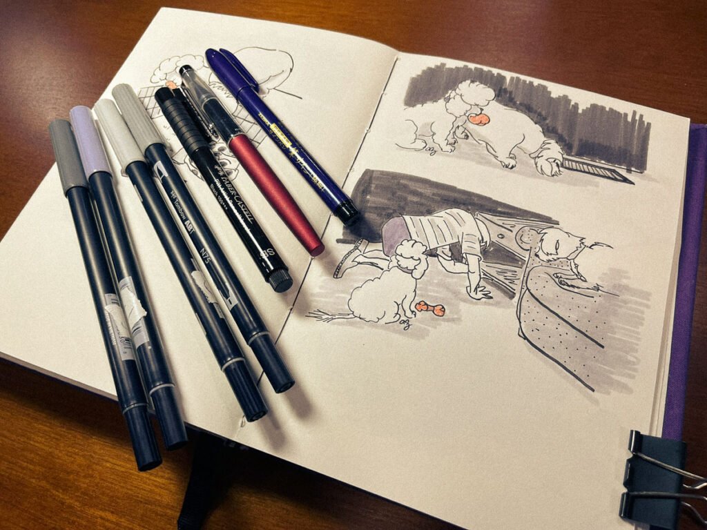
Every illustration in a zine starts with a single choice: which tool gets to touch the paper first. After dozens of pages and several near-empty ink barrels, I have a clear shortlist of pens and markers that keep earning their place on my desk. Below is the current roster, why each one matters, and a few lessons I have learned along the way.
1 · Zebra Zensations Brush Pen
The dependable workhorse
What it is: A medium-line, black, waterproof brush pen.
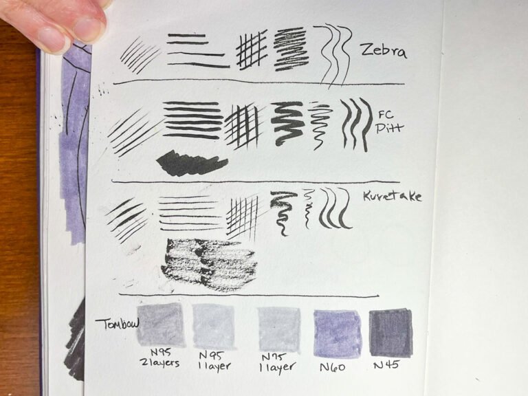
Why I reach for it: On anything under 5 × 7 inches, the nib handles both outlining and mid-level texture without fuss. Because the ink dries waterproof, I can layer markers over the lines a minute later with zero smearing.
Quirk to know: The barrel is lightweight, so long inking sessions do not tire my hand. I have yet to fray a tip, even after a full sketchbook.
2 · Faber-Castell Pitt Artist Pen (Soft Brush, Black)
The fast filler
What it is: A dark, quick-drying India-ink brush pen.
Why it stays: When I need to black out a shadow or knock in bold lettering, this pen finishes the job in a fraction of the time hatching would take. The tip can still lay down hairlines if I stand it nearly vertical, which makes it surprisingly versatile.
Drawback: Disposable. My eco-conscience nudged me to find a refillable option, which led to…
3 · Kuretake Mannen Mouhitsu No. 13
The elegant understudy
What it is: A refillable brush pen loaded with black ink cartridges.
Strengths: Smooth, expressive lines on slick, hot-press papers. The refill system means less plastic guilt.
Limitations: On my beloved mixed-media vellum the tip drags just enough to blunt the line. It is staying in the rotation for postcard work and any project on smoother stock, but the Pitt still wins on textural paper.
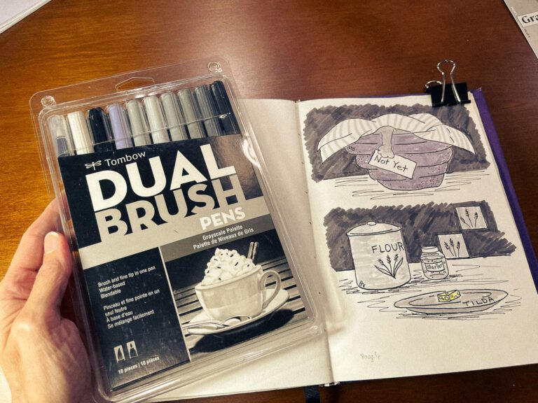
4 · Tombow Dual Brush Markers (Grayscale Set
The tonal orchestra
Role in the zines: Fast shading when full color is overkill. I rely on four “cool” numbers—N95, N75, N60, N45—for a consistent palette. (Yes, the numbers march light to dark; it only took me several months to notice.)
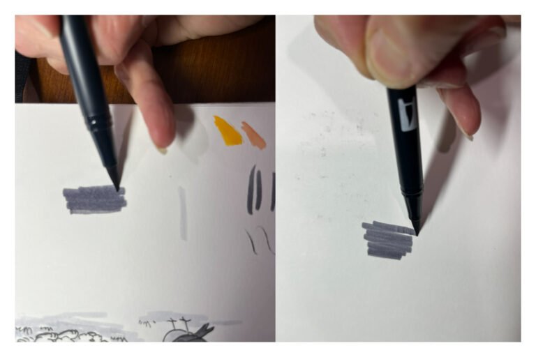
Why I love them: The brush tip lays in velvety washes while the bullet tip handles spot details—perfect for adding depth without overpowering line work.
Current gripe: The mixed-media vellum’s tooth is wearing down the brush tips faster than expected. Older markers now handle background washes; fresher tips tackle foreground work.
5 · Paper Partnerships
Strathmore 500 Series Visual Mixed Media Journal, Vellum
Texture: A tooth that grabs ink beautifully.
Color: Ivory rather than bright white. The warm base subtly shifts the cool grays; sometimes charming, sometimes distracting.
Smooth Bristol Board
Why I am testing it: Its glassy surface is kinder to Tombow tips and friendlier to the Kuretake. Early trials look promising for cleaner, sharper strokes.
On the horizon: I’m waiting for a Stillman & Birn Zeta sketchbook to arrive in the hope it will have an even slicker surface. Once it arrives, I will put the Pentel Fude Brush Pens through their paces with it.
6 · The Learning Pile
Pentel Fude Brush Pens: Promising on hot-press sheets, temperamental on vellum. Bristol will give them a fair audition while I wait for Zeta to show up.
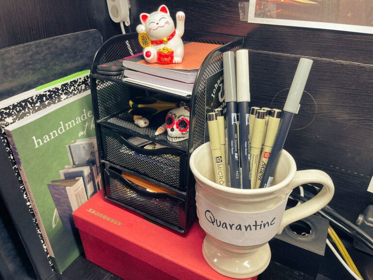
Warm-gray Tombows: Retired from zine duty. Mixing warm and cool tones in the same drawing muddied the mood, so they now live in a separate cup marked “Quarantine.”
Closing Thoughts
Choosing tools is part chemistry, part matchmaking. A pen that sings on one paper may sulk on another. For now, the Zebra Zensations leads the line work, the Pitt and Kuretake trade fills depending on surface, and four cool Tombows supply the tone. Everything else is an ongoing experiment—which is exactly how I like it.
Next up: I will report back once the Bristol sheets have a few spreads…and once the Zeta book and the Fude pens reveal whether they are divas or workhorses.

